
Corporate Identity
Brand Design
Spazio Genova: an endless road, five locations, a single brand
I recreated the identity of Spazio Genova, a historic name in the Genoese automotive scene, transforming a dated and fragmented image into a recognisable brand capable of conceptually uniting the five locations scattered across the city.
Data
January 2025
CON
Adel Digital
Role
Brand Designer
Tools
Adobe Illustrator, Adobe Photoshop, Paper, AI Tools
The context
An outdated image for a brand that needs modernising
Genoa Space it is the official dealership for Fiat, Jeep, Alfa Romeo, Leapmotor, Lancia and DR: a benchmark in the Genoese automotive landscape.
Over time, however, its communication had become dated and fragmented: the five branches did not communicate with one another, and it lacked a visual identity capable of representing them as a single coherent and recognisable entity.
Analysis
The pillars of the project
1. A symbol that unites
Five locations scattered across Genoa, but no common sign capable of holding them together in the public eye.
Problem
Problem: Spazio Genova's five locations had nothing that made them feel like part of the same brand.
Solution
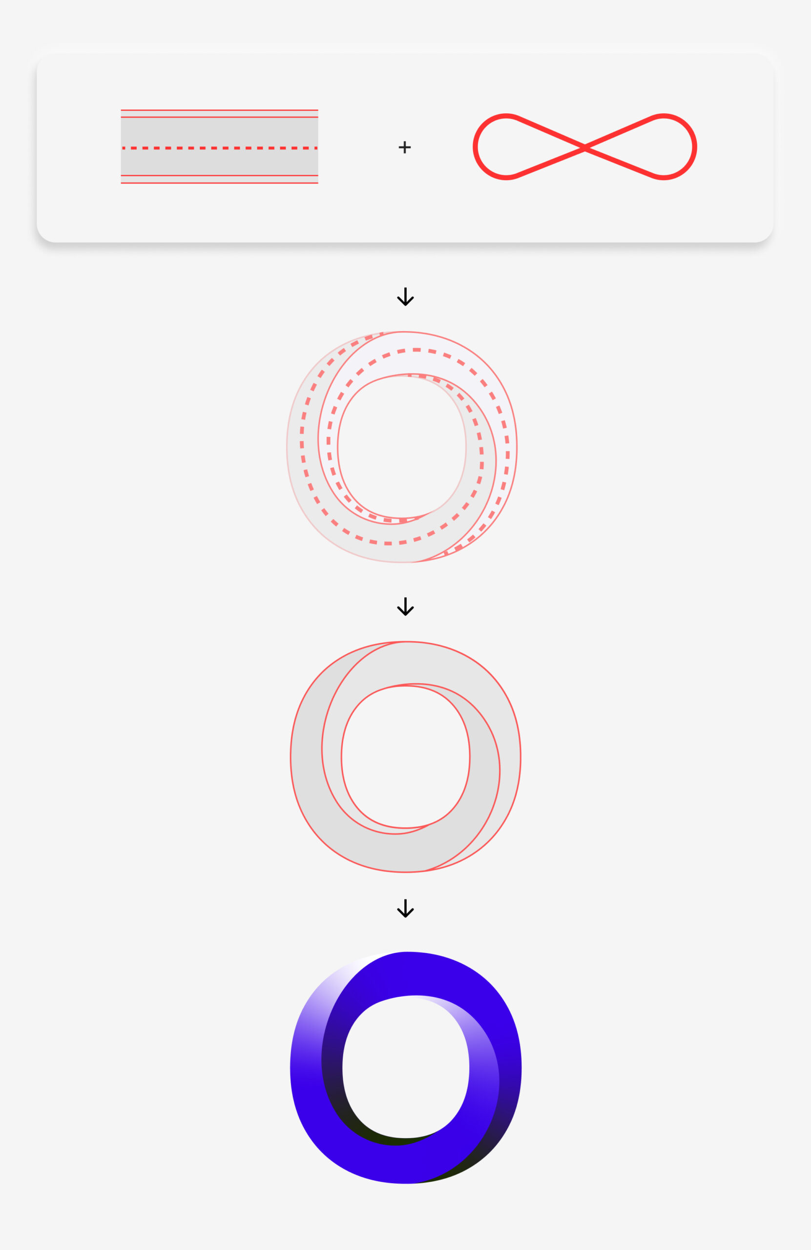
I have designed a new logo featuring a monogram that conceptually recalls the idea of an “infinite road”, capable of representing all locations as a single shared path.
2. Modern and recognisable identity
An old image communicates a business stuck in time, even when it isn't.
Problem
The old visual system was outdated and no longer conveyed reliability or modernity.
Solution
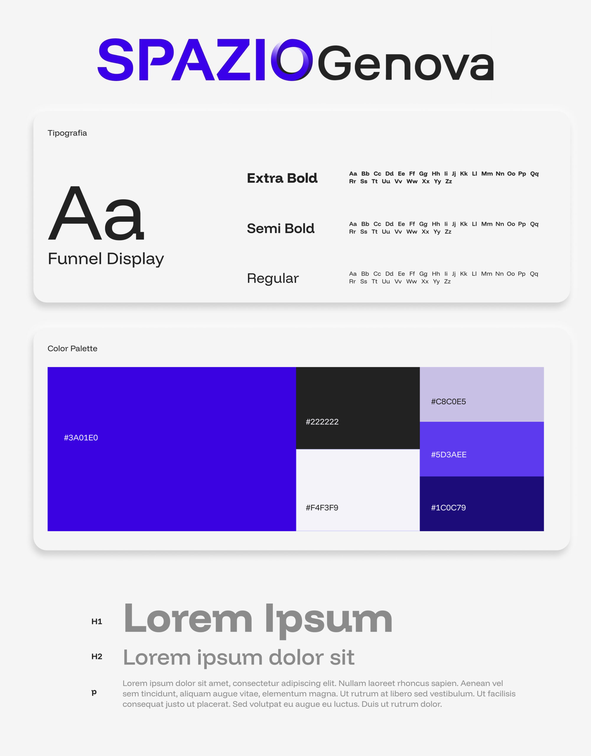
Colour palette featuring a bold and distinctive tone, paired with contemporary sans-serif typography, for an instantly recognisable brand across every touchpoint.
3. A more human tone
An automotive brand can be authoritative without being cold or distant.
Problem
The communication was rigid and lacked personality.
Solution
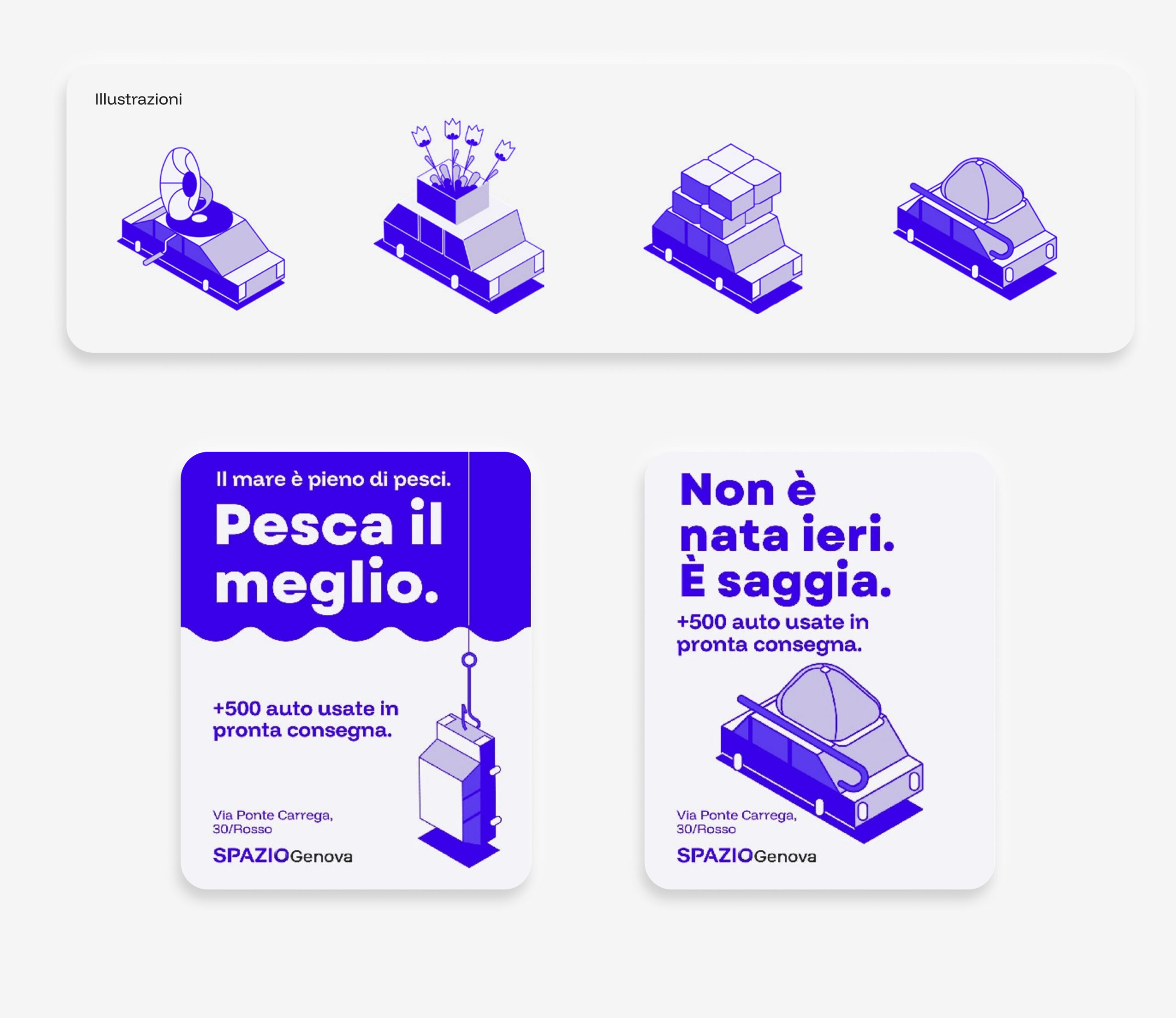
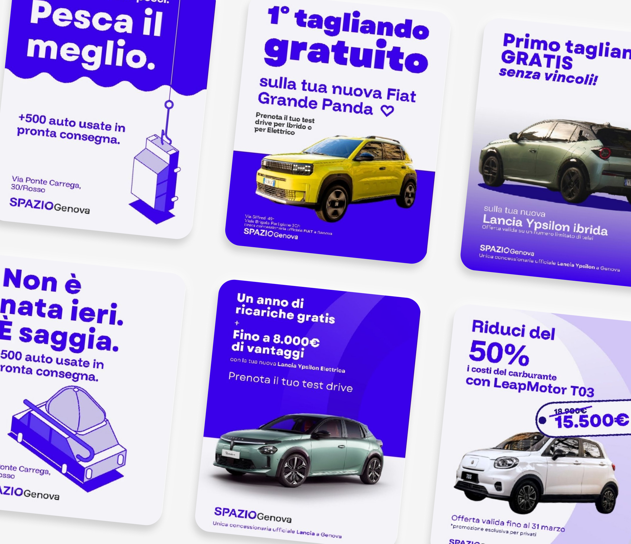
Introduction of a set of simple, geometric illustrations that break up the brand's seriousness, making it more approachable and relatable.
"The goal was to create an identity capable of uniting five different locations under a single, recognisable, modern and consistent sign across every channel."
process
How I rebuilt the brand
1.
Concept
The starting point was the concept of the “endless road“: a simple idea, capable of telling both the automotive world and the concept of a journey that connects the different Spazio Genova locations into a single narrative.
2.
Logo & Visual Identity
I drew a new logo badge, applicable to signage, paper and digital materials.
I built around the brand colour palette is one, consistent typography, combined in a flexible and easy-to-apply system.
3.
Illustrations and Visual Language
4.
Application
The result
A brand that is finally recognisable
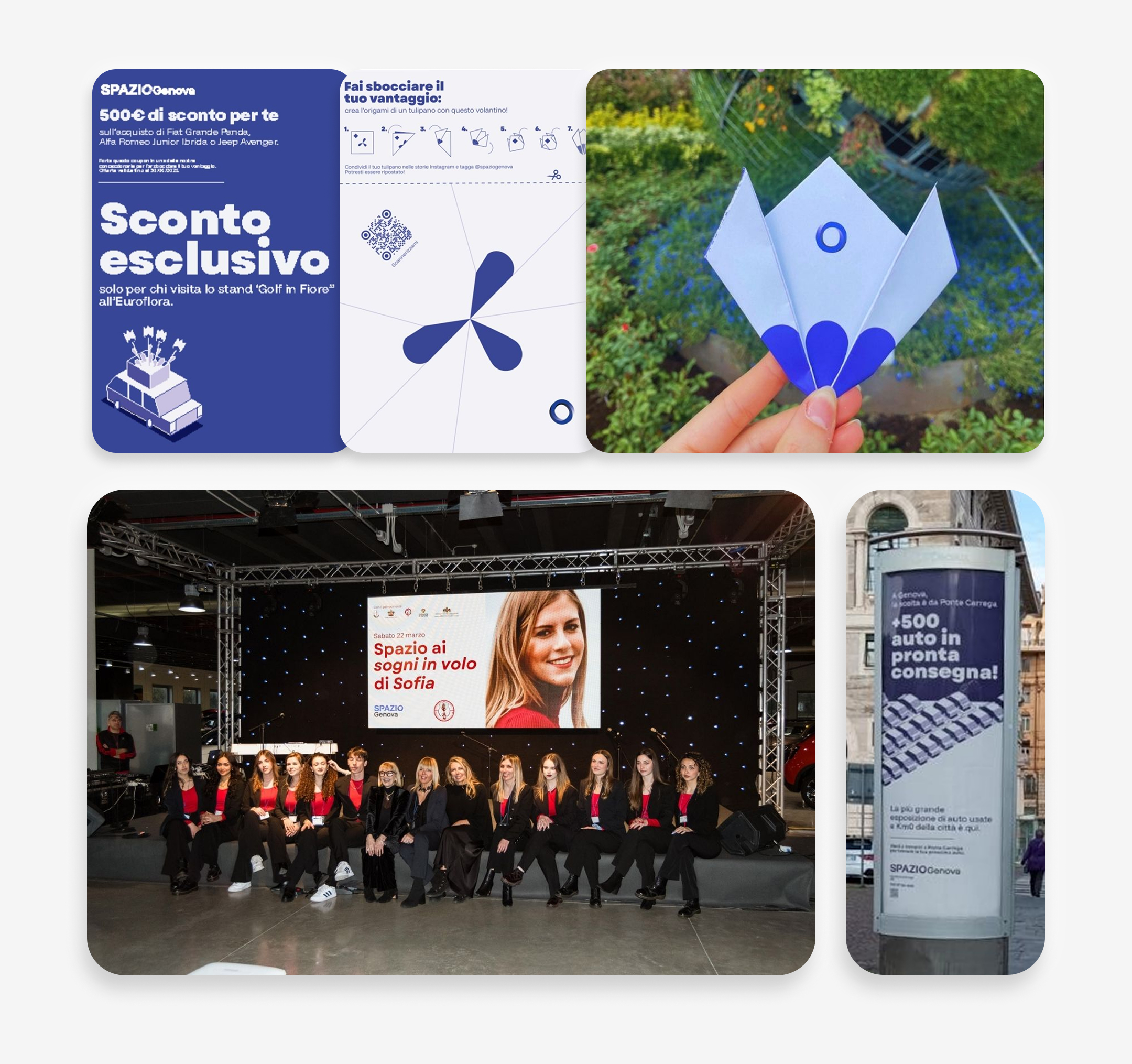
Today Spazio Genova has a consistent identity across all locations and on every channel: from offline campaigns to social media, from promotions to in-store graphics.
The new visual system has brought a increased brand recognition, an overall modernisation of the image and a visual coherence never seen before, appreciated by both the internal team and clients.
Conclusion
An Identity Ready to Grow
The rebranding of Spazio Genova was not just a graphic restyling, but the construction of a system capable of representing the company consistently wherever it is used.
Thanks to the delivered brand book, the client can now independently manage campaigns, materials and communication, while always maintaining the same strong and recognisable identity.
Vedi anche
© 2026 Martina Giovene
All rights reserved.
All materials, texts, interfaces and visual designs visible in this portfolio are protected by copyright laws. Unauthorised reproduction, distribution, modification or sharing, even in part, of any content is strictly prohibited.